
Grocery prices in New York City are significantly high for students, and there is noticeable variation in prices across different stores.
We conducted user interview with 6 participants within our designated user group, inquiring about their grocery shopping practices. We got the following insights.
Some users conduct grocery price research online before going grocery shopping.
Users exhibit diverse diet preferences and restrictions, including allergies and a preference for eco-friendly products.
Users express frustration about the need to check multiple platforms offered by grocery stores when they research grocery prices.
Based on these insights, we created 2 personas and user journey maps. We have also sorted out the requirements.


How might we secure access to affordable groceries that match the diverse lifestyle of students in NYC?
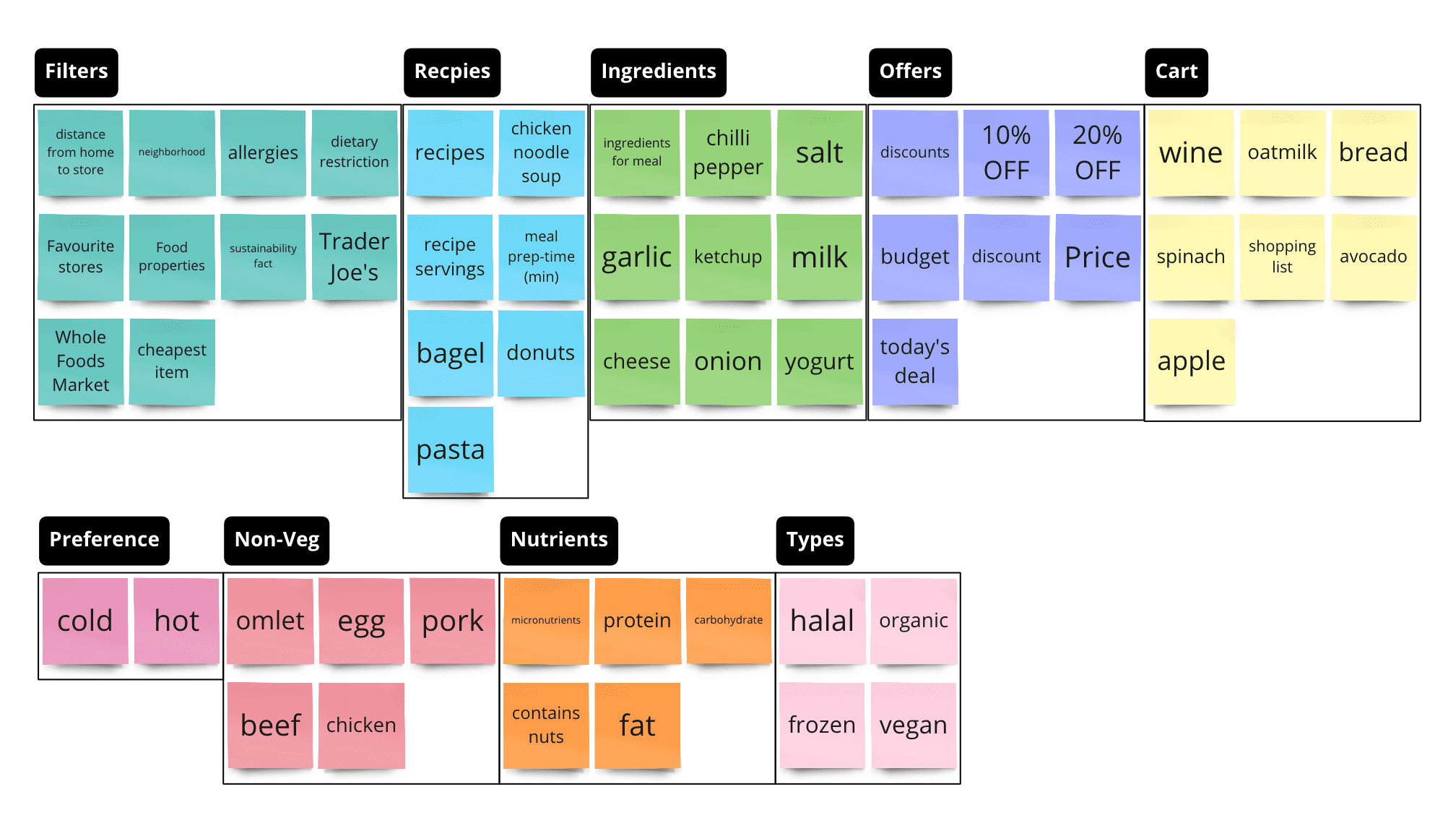
We conducted card sorting using Miro and tree testing using Optimal Workshop with 6 participants to find how they organize grocery-related information. We obtained 2 major insights from card sorting and tree testing.
While users had varying ways of imagining categories in card sorting, when it came to our tree testing we found that users tended to navigate our app as though they were navigating a traditional grocery store layout
- Vegetables/Meat&Fish/Dry Foods/Frozen foods etc.
The users we tested seemed to display behavior that showed that they approached the search for each food item as a discrete, individual task to be optimized.
They displayed some inclination to navigate to items through recipes, but the data showed us that searching item by item was a more immediately intuitive task.
Based on these insights, we created a sitemap.

Our key solution to this problem is to create an app that lets users compare grocery prices of nearby grocery stores with the consideration of their diet restrictions and preferences.

Users can set their profile information to personalize the grocery search results. Users can set the following.
Users can compare prices of grocery items sold in nearby grocery stores.
After users compare grocery prices, they can save the items to buy in their shopping lists.
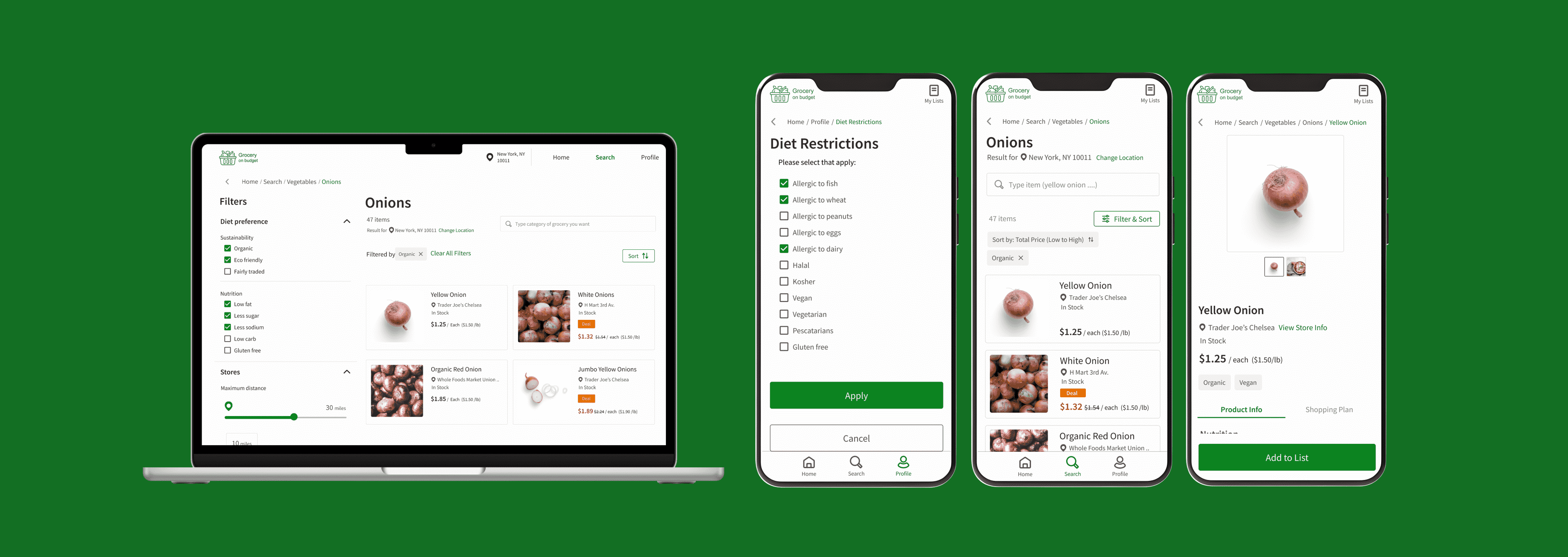
We started by creating paper wireframes and then low-fidelity prototypes.


We tested our low-fidelity mobile and desktop prototypes with 6 participants. Participants were asked to do the following 3 tasks.
Task1: Compare groceries
Find the cheapest organic onion available within 30 miles of your area.
Task2: Set profile (diet restriction)
You are vegan and want to see only vegan items throughout the website. What do you do?
Task3: View items on the shopping list
You are going to go shopping for Thanksgiving dinner. Find the shopping list that you have already created.
As a result, we gained the following 4 insights through the user testing. We incorporate the feedback into our high-fidelity prototypes.
4 out of 6 participants were confused about the use of the 'Home' page for displaying the shopping list. Participants indicated a preference for having the shopping list accessible in the top-right corner, similar to where they commonly find carts.

2 out of 6 participants noted uncertainty about whether their changes had been successfully applied on the profile page due to the absence of save buttons. In response, we implemented apply buttons to explicitly indicate when changes are made.

3 out of 6 participants mentioned that they would like to have their location shared so that they would be able to view only the items near them. We added the location information on the price comparison page so that users can check the current search area.

2 out of 6 participants highlighted the need for a feature that enables them to go back to previous pages in our desktop design. In response, we introduced go-back buttons and breadcrumbs to enhance user navigation.


In this project, it was remarkable to observe disparities between our assumptions and the actual opinions and behaviors of users. That reminded me of the significance of human-centered design. Additionally, we recognized that product design involves numerous steps.
In this iteration, we assumed that grocery price data is already available. In the next iteration, we aim to explore methods for collecting data.
We simplified the grocery information for this iteration. However, in a real-world scenario, prices may fluctuate due to limited-time deals, and the conditions of discounts can be complex. We need to consider this complexity and incorporate it into our design.
For the 'My List' feature, we concentrated on browsing lists and adding grocery items in this iteration. Our next goal is to delve into designing list management, including functionalities such as creating, editing, and deleting lists.